
THE INTERNATIONAL UGLY NECKLACE CONTEST:
A Jewelry Design Competition With A Twist!
Past Contests -- View
the Galleries of Entries
2003
1st Annual Entries
2003 Semi-Finalists and
Results FIRST
ANNUAL, 2003
2003, Gallery 1 | 2 | 3
2004 2nd Annual Entries
2004 Semi-Finalists and
Results SECOND
ANNUAL, 2004
2004, Gallery 1 | 2
2005 3rd Annual Entries
2005 Semi-Finalists and
Results THIRD
ANNUAL, 2005
2005, Gallery 1 | 2
2006 4th Annual Entries
2006
Semi-Finalists and
Results FOURTH
ANNUAL, 2006
2006, Gallery 1 | 2 |
3 |
4
2007
5th Annual Entries
2007 Semi-Finalists and Results FIFTH
ANNUAL, 2007
2007, Gallery 1| 2
2008 6th Annual Entries
2008 Semi-Finalists and Results
SIXTH ANNUAL, 2008
2008, Gallery 1| 2
2009 7th Annual Entries
2009
Semi-Finalists and Results, seventh ANNUAL, 2009
2009, Gallery 1
2010
8th Annual Entries
2010
Semi-Finalists and Results, EIGHTH ANNUAL, 2010
2010, Gallery 1 | 2
2012 9th Annual Entries
2012
Semi-Finalists and Results, Ninth ANNUAL, 2012
2014 10th Annual Entries
2014 Semi-Finalists and Results, Tenth ANNUAL, 2014
THE PREMISE: It Ain't Easy Doing Ugly!
The UGLY NECKLACE CONTEST is a jewelry design
contest with a twist. The contest presents a challenge not often tackled
-- at least intentionally. The contest draws the jewelry designer into
an alternative universe where beautiful artists create ugly necklaces.
It's not easy
to do.
"Ugly" is more involved than simple surface treatment. It is not just laying out a bunch of ugly parts into a circle. It turns out that "Ugly" is something more than that. "Ugly" is the result of the interplay among Designer, Wearer, and Viewer. "Ugly" is very much a result of how a necklace is designed and constructed. "Ugly" is something the viewer actively tries to avoid and move away from. "Ugly" has deep-rooted psychological, cognitive, perceptual, sociological and anthropological functions and purposes.
As research into color and design has shown, your eye and brain compensate for imbalances in color or in the positioning of pieces and objects – they try to correct and harmonize them. They try to neutralize anything out of place or not quite right. You are pre-wired to subconsciously avoid anything that is disorienting, disturbing or distracting. Your mind and eye won’t let you go here. This is considered part of the fear response, where your brain actively attempts to avoid things like snakes and spiders.... and ugly necklaces.
This means that jewelry designers, if they are to create beautiful, wearable art, have to be more deeply involved with their pieces beyond "surface". Or their pieces will be less successful, thus less beautiful, thus more disturbing or distracting or disorienting, thus more Ugly.
Luckily, for the jewelry designer, we are pre-wired to avoid these negative things. This makes it easier to end up with pieces that look good. Beauty, in some sense, then, is very intuitive. On the other hand, it makes it more difficult to end up with pieces that look bad. You see, Ugly goes against our nature. It's hard to do.
To achieve a
truly hideous result means making the hard design choices, putting
ourselves in situations and forcing us to make the kinds of choices
we're unfamiliar with, and taking us inside ourselves to places
that we are somewhat scared about, and where we do not want to
go.
- Can I push myself to use more yellow than the purple warrants, and mix in some
orange?
- Can I make the piece off-sided or disorienting, or not have a clear beginning,
middle or end?
- Can I disrupt my pattern in a way that, rather than “jazz,” results
in “discord?”
- Can I work with colors and materials and patterns and textures and placements
and proportions I don't like?
- Can I design something I do not personally like, and perhaps am unwilling, to wear around my neck?
- Can I create a piece of jewelry that represents some aweful feeling, emotion or experience I'm uncomfortable with?
- Can I make
something I know that others won't like, and may ridicule me for
it?
Because answering questions like these is not something people like to do, jewelry designers who attempt to achieve “Ugly,” have to have a lot of control and discipline to override, perhaps overcome, intuitive, internally integrated principles of artistic beauty. The best jewelry designers, therefore, will be those artists who can prove that they can design a truly Ugly Necklace. In our contest, we invite all those jewelry designers out there to give it a try.
The
Ugly Necklace Contest is one of the many programs at The Center for
Beadwork & Jewelry Arts in Nashville, Tennessee, that encourage
beadwork and jewelry makers to test their design skills, and learn some
fundamentals about jewelry design in the process.
What Is Ugly?
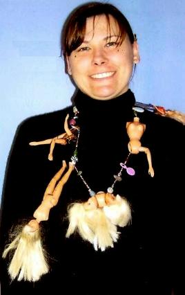
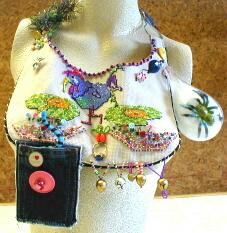
Different participants in The Ugly Necklace Contest interpreted "Ugly" in different ways. Some focused on the ugliness of each individual component. Some used materials that they felt conveyed a sense of ugly, such as llama droppings, or felted matted dog hair, or rusty nails, or cigarette butts, or a banana peel. Some focused on mood and consciousness, and how certain configurations of pieces and colors evoked these moods or states of consciousness. Others focused on combining colors which don't combine well. Still others focused on how the wearer's own body would contribute to a sense of ugliness, when wearing the piece, such as the addition of a "Breast Pocket" which would lay just below the woman's breast, or peacock feathers that covered the wearer's mouth, or the irritating sounds of rusty cow bells, or the icky feeling of a rotting banana peel on the skin. Still others saw Ugly as as sense of psychological consciousness, such as being homeless, or an uncomfortable transition from adolescence to adulthood. For some Ugly meant politically ugly, like Saddam Hussein of Iraq, or the trans-fats associated with fast foods.
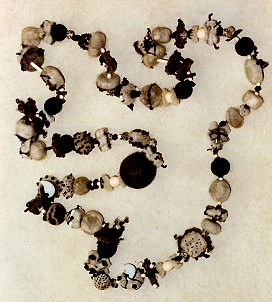
It is not enough just to string a bunch of ugly beads on a wire. Ugly pieces do not necessarily result in an ugly necklace. As one entrant learned, when she strung her ugly beads together, the final project was beautiful, and sold for $225.00, before she could enter it into the contest! Actually, if you look at many of the entries, you see that ugly pieces, once arranged and organized, don't seem as ugly. Organization and arrangement contribute their own qualities and sense of beauty that transcends the ugly parts.
Adding to the fun, the contestant also has to create a piece of jewelry which is functional and wearable. This is what sets beadwork and jewelry design apart from other design arts. A piece of jewelry as art, (even Ugly art), has to maintain its essence and purpose, even as the wearer moves, bends down, or rubs against things. Jewelry is Art as it is worn. Jewelry is not a subset of painting or a type of scultpture. Jewelry is something more. Jewelry is art and architecture in motion, often frenetic motion. The pieces that make it up, and the techniques and designs which coherently interrelate these pieces, must also anticipate this dynamic totality. Otherwise, the piece of jewelry becomes a failure not only as a piece of jewelry, but of art, as well.
The Ugly Necklace Contest is an arena for budding and established beadwork and jewelry designers to strut their stuff – to show how adept they are at creating ugly-necklace-pieces-of-art. It’s a jewelry design competition with a twist.
The finalists of
The Ugly Necklace Contest are those beadwork and jewelry designers
who can best elaborate upon rules of design, whether intuitively
or strategically. These rules of design are, in effect, an underlying
grammar and vocabulary – the theoretical and professional basis
of beadwork and jewelry making as art, not just craft.
The Ugly Necklace Contest -- The Judges Criteria
Each necklace was scored on 10 jewelry design criteria. What each criterion means, and how they were used to evaluate the necklaces, are discussed below.
These criteria were:
1. Overall Hideousness
2. Clever Use of Materials
3. The Clasp Assembly
4. Violation of Color Principles
5. Bad Balance or Arrangement
6. Bad Rhythm and Focus
7. Dis-Orientation
8. Parsimony
9. Wearability
10. The Poem
1. Overall Hideousness
A measure of the judges' overall reactions to the piece and its noteworthiness.
The idea of "Noteworthiness" is key here. Noteworthiness means the extent the artist took something ordinary and made it extraordinary.
The best examples were the unexpected use of familiar materials. For example, felted dog hair shaped into beads; llama droppings, colored and drilled to be used as beads; a toothbrush used as part of a clasp assembly; a banana peel used as a pendant drop.
In some cases, the artist tried to make the necklace into a political statement, such as the Saddam Husein necklace with bullets and pink shoes; or the glutonous fast food necklace with the gummi hot dog and gummi bun as the clasp.
In many cases, found objects, insignificant on their own, were organized to call attention to special meanings, such as the grenade box found among shells at the beach; or the remaining parts of a cat along with the chicken bone that led to her demise; or plastic jewels that seemed electrifying to the designer as a young girl, and so not as an adult.
Other things the
judges look at include the clasp assembly, the artist's anticipation
of the effects of wearing the piece, the overall goals of the artist
with the piece, and their first reaction to the piece.
2. Clever Use of Materials
The degree the piece represents a clever use of materials, how they interrelate,
and how they are coherent.
In too many cases, the jewelry artist chose ugly pieces and assumed that a necklace made of ugly pieces would itself be ugly as well. But as you can see from the images on this web-site, this strategy does not work well.
The artist has to have a deeper understanding of why the materials are ugly. The artist also needs to stay focused and strategic enough in the design process, so that she or he maintains this sense of ugly as the necklace gets organized.
For example, one necklace used felted matted dog hair, and made beads out of this. This was a start at a clever use of materials. But once strung into a circle, the necklace looked like something someone might actually wear.
A necklace of cigarette butts, again once organized into a circle, doesn't look quite as ugly. In addition, the necklace over-used cigarette butts -- too many -- which started to make the necklace a bit boring. This diminished the power of the cigarette butts to make a statement about "ugly".
This criteria looks at the total picture. Not just the ugliness of each individual piece. But also the degree to which the assembly of pieces maintains this sense of ugliness. The concern here is "design-cleverness in the USE of materials".
3. The Clasp Assembly
How well the clasp design contributes to the ugliness of the piece, without
diminishing the piece's functionality and wearability.
A better clasp assembly is one that seems to be an integral part of the necklace, not just an after-thought or add-on. It should anticipate how it contributes to the ugliness of the piece, how it re-affirms the artist's concept and goals, and how it adds to the wearability of the piece.
Successful Clasp Assemblies:
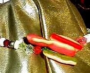
A gummy hot dog closes into a candy gummy bun
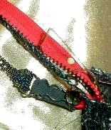
There is an elaborate strap, zipper, and suspender toggles system as the clasp assembly. With different configurations of parts, the necklace may be worn as a choker, a back pack, a wrap, a fanny pack, a clutch, or a traditional over-the-shoulder and around the neck necklace.
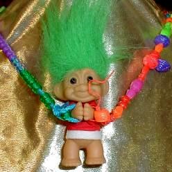
The troll is the clasp. One end of necklace string is tied into a loop and wraps around the left hand of the troll. The other end of the necklace string is tied into a loop and wraps around the right hand of the troll. The two hands of the troll push apart to open up.
4. Violation of Color Principles
The degree the piece violates good principles of color. This might include
using colors in incorrect proportions; or which violate color schemes;
or violate rules of dominance/submission; or disturbing arrangements -
vertical vs. horizontal, shading and tinting, sharp vs. blurred boundaries,
placements and balance, projecting forward vs. receding; or violating socio-cultural
rules and expectations.
This is self-explanatory. For example, the appropriate proportions of yellow to purple should be 1:4, meaning in any grouping of 5 beads, 4 should be purple and 1 yellow. When you deviate from this, your piece gets uglier.
| Appropriate color mix | ||||
| Less appropriate color mix | ||||
Least
appropriate color mix |
||||
COLOR THEORY discusses
the use of the color wheel to select colors that work together within
a "scheme". There are many schemes, including Analogous, Complementary,
and Split Complementary. An ugly necklace would select colors that
violate this scheme. This might
mean
selecting
colors
that
do not
fit together within a scheme. It might mean using the wrong proportions
of color within the scheme. It might also mean violating expectations
about which colors should and should not predominate within the scheme.
5. Bad Balance or Arrangement
The degree to which sizes, shapes, textures, materials do NOT balance,
or are poorly arranged within the piece.
This is self-explanatory. Does the placement seem satisfying, such as a graduated necklace that starts with smaller sizes, works up to larger sizes in the center, then works back down to smaller sizes at the clasp? Or, not?
When looking at the piece, can you see alternative arrangements that might make the piece look even uglier?
Another aspect of bad balance and arrangement has to do with "dimensionality". This is the degree, whether the piece is flat or 3-dimensional, that this is satisfying, or not. For example, a flat loomed piece with an extra large button clasp on the top of it, would probably be less satisfying than one with a smaller clasp on the end of the piece. Dimensionality can also be created through mixing beads or objects with different finishes, like mixing glossy and matte. An ugly mix somehow would feel dissatisfying.
6. Bad Rhythm and Focus
The degree the piece does NOT engage and lead the viewer's eye.
One of the goals of the jewelry artist is to motivate the viewer to take in, experience and appreciate the whole necklace. One of the major techniques is to create a rhythm with the patterning of the beads, and to create a focal point. This influences the viewer's brain/eye to want to see each part of the necklace from beginning to end, and then come to rest.
An ugly necklace, would either have no rhythm or a boring rhythm or a nauseating rhythm. An ugly necklace would either have no focal point, or have a focal point that is in a very disorienting or disturbing place on the necklace, or be very disorienting or disturbing in and of itself.
RHYTHMS
| Fast, staccato | ||||
| Moderate, fox-trot | ||||
Slow, glide or slide |
||||
7. Dis-Orientation
The degree the piece is disorienting, meaning the degree it does NOT suggest
what is up or down, or what is right or left.
Jewelry plays a critical psychological role for the viewer in a room or in a space. It orients them. It is one of the important things in any person's visual environment that lets the person know what is up and what is down, and what is right and what is left.
The natural state in life is to be dis-oriented. It takes walls and ceilings, trees and horizons, things with clear right angles, clear perpendicularity, obvious horizontal and vertical planes, to enable us to orient ourselves within any space.Otherwise people would fall down, lose a sense of how to turn or position themselves, or feel paralyzed.
The wearing of jewelry plays a critical function here, in that it visually establishes for the viewer appropriate horizontal and vertical lines and planes. If you see someone with their earring dangle at a 90 degree angle, or their necklace turned around so that the clasp is showing when it shouldn't -- you know how uncomfortable this makes you feel, even wanting to cringe. And you know you want and need them to straighten things out. This jewelry is dis-orienting you, at a time when you subconciously rely on it to be orienting.
If this wasn't important,
things like the odd-angled dangle wouldn't bother you....But we know
that it does.
8. Parsimony
The degree the piece doesn't seem overdone or underdone.
Once the artist has made their point, they don't need to keep making it. For example, one entry used plastic trolls to create a sense of Ugly. There were over 20 on the necklace, but in their particular design, 6 or 8 were probably sufficient. The additional trolls served no other purpose in this piece. Just throwing in a lot of ugly pieces doesn't necessarily result in something that is uglier. The additional trolls could have been used to make additional design points, but they were not. Instead they added a sense of repetition and disinterest.
A necklace of felted dog hair beads was a very clever idea. It was over 36". No other design points were made, so an 18" necklace of felted dog hair beads would have been as good as 36". In a similar way, a very long necklace of cigarette butts would have been equally as good, or better if shorter, since no other design points were made.
The necklace of Barbie Doll parts doesn't feel like it uses too many parts, or too few.
9. Wearability
The degree the artist has been attentive to how the piece will be worn,
particularly if the wearing of it might enhance its ugliness.
From a design
perspective, Jewelry is Art As It Is Worn.
In otherwords, you can only appreciate the artistic qualities and sensibilities of any piece of jewelry only when you see it worn -- as it moves with the body, as it conforms to the body, as it enhances the wearer's sense of self, and the viewer's sense of the situation and context.
In our contest,
we set the rule that the piece has to be Wearable.
This rule tends to make it more difficult to achieve "Ugly", but
we've had some clever submissions that succeed here.
Some examples
from our entries:
- Peacock feathers that would fill the wearer's mouth
- An over-the-shoulder necklace that struggles to stay on the
shoulders
- A breast pocket strategically placed on the tip of the breast
- Bloody teeth or a rotting banana peel meant to be worn against
the skin
The breast pocket
Dental floss and bloody teeth
To the judges, wearability means that there should be clear evidence that the designer anticipated where the parts came from, and where they are going to, when the piece is worn.
10. The Poem
How well the artist made their point about their design intentions, as
reflected in their Ugly Necklaces
The poem must relate to the piece. It should clearly explain the
artist's goals and concept. It should detail the artist's strategies
for making the design choices she or he did.
The judges ask
themselves, given what the artist wrote in the poem, to what degree
have they successfully created an ugly piece of jewelry?
The Ugly Necklace Contest --
The Story How This
“ Jewelry Design Competition With A Twist”
Came
To Be
Beading has been done throughout history and in every culture in the world, though it is not always done in the same ways or for the same reasons. Sometimes beads are used instead of money, or to facilitate trade. Beads have some kind of intrinsic value that, in some cases, is more universally perceived, valued and accepted than minted coins, printed currency or items traded. Sometimes beads are used to justify inequities in power relationships. People with the more beads and beaded objects have the more power. Othertimes they are used simply to make someone look and feel more beautiful. Beads often bring people closer to a spiritual sense of well-being, such as a Catholic or Buddhist or Chinese rosary. Beads can take on symbolic meanings, such as how Zulu tribes used beads to create a system of communication during apartheid.
While beads and beading have been important throughout time, this has been especially so in the United States since the early 1960s. America’s interest in beadwork over the last 40 years has become in and of itself a major social movement as Bead Craft has become Bead Art has become Bead Design.
In the early 1960s, two new stringing materials were developed. One was Nymo thread, a nylon thread developed for the shoe industry to attach the bottom of the shoe to the top of the shoe, and widely used in upholstery. The other was a flexible, nylon coated cable wire called tigertail. Before this time, beads were strung primarily on cotton or silk thread, or nylon fishing line. Cotton and silk both break down within 3 – 5 years, so anything strung on them has to be redone. Nylon fishing line dries out and cracks in ultraviolet light and heat, so it too is not a durable stringing material.
Thus, for the most part, before 1960, beading was primarily considered a home craft. Beading did not attract artists, did not attract fine craftspersons, did not attract academics, did not encourage people to push the envelope with the craft by experimenting with new techniques, designs and materials. While periodically in history you see examples of elaborate beadwork, such as French beaded purses in the 1920’s or Russian bead embroidery in the 1800’s, these works were primarily done by people who were either slaves, serfs or indentured servants. As soon as these people were freed (changing labor laws in France or deposing the Czar in Russian), the elaborate beadwork stopped or diminished. A rational person would not spend all this money on beads, and all this time making something, if it was going to fall apart.
With the introduction and adoption of Nymo thread and tigertail cablewire into beadwork, the craft did begin to attract these types of people. Suddenly artists, fine craftspersons and academics started paying attention to what they could do with beads. This movement started in southern California, and gradually worked its way across the country. The first Bead Society was founded in Los Angeles in the early 1960’s. Today there are over 200 bead societies across US. Everyone has been getting into beading. There has been an explosion of magazines. There has been an increase in the number of bead research societies and bead museums. The craft of beading has been re-energized over the last few decades as a vibrant art form.
Beading education has lagged the trend where Craft has merged into Art. Traditionally, classes in beadwork have been provided by stores that sell beads. These classes teach a particular technique to do a particular project, and are representative of a traditional craft-approach. Students are taught to follow steps. Design, theory, color, construction, manipulation, wearability, durability, functionality issues are almost irrelevant. What is important is the repetition of steps to produce an object. There is no training on how to make choices in choosing and relating materials, in picking one technique over another, or how to think through the creation and application of new techniques, materials and methods.
In the year 2000, we founded The Center For Beadwork & Jewelry Arts (CBJA) in Nashville, Tennessee. A small group of beadworkers, beading teachers and artists spent almost 1 ½ years researching the bead (and other crafts) education field, to determine if they could come up with a more professional model for teaching beadworking and jewelry making. They broke down each type of bead weaving stitch and each type of jewelry making technique into more generic components. They evaluated whether it mattered, -- (and, if so, to what degree it mattered)--, what order these components were presented to the student. That is, if techniques were broken down into generic components, and taught in a certain order, would students learn better? Could beading be taught as a set of tools with theories and strategies for applying these tools? Could we control and measure student progressions through these ordered components and their applications, and award certificates of excellence to those who mastered these tools, and the accompanying theories and strategies for applying them? We answered yes, and began offering a structured, ordered, design-oriented curriculum in 2001. [The CBJA curriculum is outlined on-line at http://www.landofodds.com/beadschool/ ]
The Ugly Necklace Contest, first announced in 2002, was one of the programs CBJA launched as a way to reaffirm our beliefs in a design-oriented, theory-based, professional craft education curriculum. The Contest was conceived as a fun way to break students out of the traditional craft mold, and get them to think, ponder, and translate their feelings and perceptions of what is “Ugly” into an organized and functional necklace design. [ http://www.warrenfeldjewelry.com/wfjuglynecklace.htm ]
We made the contest national. We launched it on-line. Our goal was to politely influence the entire beading community to think in different terms and to try to work outside the box. We also wanted very actively to stimulate discussion about whether there are universal and practical design theories which underlie beadwork, and which can be taught. It has gotten a lot of attention.
In our first year, we received 58 entries from twenty different states. In our 2nd annual contest, we received 63 entries from sixteen different states. Each entrant was asked to submit hard copy photos of the necklace and a written poem. If they wanted, they could submit more supporting materials. The purpose of the poem was to give the artists a chance to make their necklaces, and their design decisions, more apparent to the judges.
Different participants interpreted "Ugly" in different ways. Some focused on the ugliness of each individual component. They strung a bunch of ugly beads on a string. Some used materials that they felt conveyed a sense of ugly, such as llama droppings, or felted matted dog hair, or rusty nails, or a banana peel. Some focused on mood and consciousness, and how certain configurations of pieces and colors evoked these moods or states of consciousness. Others focused on combining colors which don't combine well. Some used cultural-specific or situation-specific definitions of ugly, such as an image of Saddam Hussein or the placement of orthodontia braces on an elk’s jawbone. Still others focused on how the wearer's own body would contribute to a sense of ugliness, when wearing the piece, such as the addition of a "Breast Pocket" which would lay just below the woman's breast, or peacock feathers that covered the wearer's mouth, or the irritating sounds of rusty cow bells, or the icky feeling of a rotting banana peel on the skin.
Six judges were selected who were associated with The Center for Beadwork & Jewelry Arts. They met one evening to review all the entries and select 10 semi-finalists. The first part of the evening was spent in a training session so that these beadworking teachers and artists could practice applying 10 jewelry design criteria in judging entrants. They were presented with four conceptual precepts underlying the creation of the Contest itself:
1. The Necklace should be Ugly, yet still function as a piece of jewelry.
2. Better designers will demonstrate a degree of control over achieving
these ends.
3. Better designers will show a sense of how both the larger context
within which the jewelry is worn, as well as the overall effects of the
wearer wearing the piece, will increase the piece’s Ugliness.
4. Better designers will have an intuitive design sense; best designers
will show some strategic control over the design process.
Then they went to work. They evaluated each Ugly Necklace according to 10 jewelry design criteria, and scored each criteria on a 1-10 scale of NOT AT ALL to VERY MUCH SO. All the judges’ scores were added up, and averaged, to create an ADJUSTED JUDGES SCORE. Each criterion was weighted equally. The 10 necklaces with the highest average scores were selected as our 10 semi-finalists.
The CBJA offers three
jewelry design classes, taken in sequence. These classes review an
extensive list of design criteria and their application
to beadwork and jewelry design. From this list, ten particularly important
criteria were chosen for use in this Contest. These 10 criteria were
felt to be the most critical in design, and the most appropriate to use
in this first year of judging. These criteria included things like the
piece’s “Overall Hideousness,” “Materials Used,”, “Clasps
and Support Systems”, “Color Rule Violations”, “Balance,
Proportion and Distribution Rule Violations”, and “Rhythm,
Focal Point, and Orientation Rule Violations”.
Ten Semi-Finalists were picked. They were asked to submit the actual
necklaces to us, to be put on display at Be Dazzled Beads. We took
3 images of each one – a full frontal image showing someone wearing
the piece, a close-up, and a close-up of the clasp assembly. We posted
these images, along with the poems, on-line at the Land of Odds web-site
(www.landofodds.com) so that visitors to the site could vote for the
winner and runner up. The winner got a $992.93 shopping spree on the
web-site; the runner-up got a $399.07 shopping spree on the web-site
What Participants Have To Say!
Loving to see this contest !! It is a running joke in my circle that
I
have talked about opening a bead shop called /What An Ugly Necklace. /
Wouldn't it be great answering the business phone?
--Janis Tingstrom
ATTN: Judges: Bribable.
My Promise to You:
A) The judges will faint, upon viewing my entry
B) It will be "UGLIER" than Pittsburgh
C) It consists of beads having UGLY history
D) You will NEVER contract me to design your personal showpiece
E) I am not ugly -- in mind or body
-- Mary Reilly
Congratulations to the author(s) of this idea. I for one, had a lot of fun putting together the entry material -- Robert De Luccia
Thanks for the opportunity to delve and search.....for what may be ugly to one is beauty to another..... -- Sherry Masters
How much fun is this?! Whoever came up with this contest idea is a frickin' genius!! While on one of our Saturday morning bead hunting junkets (estate sales, yard sales, thrift stores, etc), we spotted a particularly ugly necklace at our favorite local antique shop. We held it up, made a few Flintstone jokes, had a good giggle, then moved on. Weeks later, upon learning about your contest, we immediately remembered this particular necklace. Needless to say, we rushed to the antique shop, hoping and praying our find was still there. Much to our delight, there it was ... the necklace so ugly it bites back. We plunked down the $10 price and the rest is history. -- Shelly & Kelly Houston
I apologize for the blurriness of the bottom picture, the camera and I were having a fight. It didn't want to take a close shot of my necklace because it was so UGLY! It did everying to try to make the necklace pretty, from blurring, to bighting, to backing away, so I had to choose the best 3 shots that I had...... Please know that my husband and I are very capable of creating much prettier necklaces and bracelets. -- Melinda and James Lunsford
I read of your contest and felt like it had been made just for me! I love to write and I love to craft. So I wrote a poem about a necklace and then set about making the necklace I had written about. -- Linda Allison
Here's my entry for your intriguing "Ugly Necklace Contest." Thanks so much for sponsoring this competition. It's a great one because everybody's a winner -- either you get the prizes or you find out your necklace isn't as ugly as you thought it was! -- Suzanne Ivester
It has been fun not only making a necklace for your Ugly Necklace Contest, but coming up with a poem about it as well. I got so carried away, I even made a hat to go with it. Never miss a chance to accessorize! -- Nancy Jane Johnson
Comments from forums and newsgroups:
What a big bunch of ugly fun! Thanks for sharing this with us, and for organizing
the contest.
Heh, I had the entry form for this contest...then I realized I am not good enough yet to make anything THAT ugly!
All I can say is, I'm glad I don't have to wear any of them!
Boy, it is hard to try and design an "ugly" necklace. You have to really break out of your box! I had considered entering this contest back when they first announced it. First place winner is going to get almost 1000 bucks worth of beads from Land of Odds. I went and voted! Everyone else should too! No need to register, just choose the "ugliest" one. That isn't easy to do either! LOL!
Hehe...so what do you do if you can't decide? They're all pretty hideous looking! =)
I have one question: How is the banana necklace holding up? I think this competition is awesome! I spent last night and this morning plotting my September submission.
I submitted one picture
of my very pretty friend Kathleen wearing the necklace. I think this
ugly necklace made Kathleen break out in ugly. -- Mary Dellucci
dear warren
I have just returned from my 12th haute couture season in paris. I want you
to know that your so called ugly necklaces have some real charm to them, real
wit and real style. Why you call them ugly is anyone's guess. I design my own
line of jewelry and would probably not design a necklace such as what you showed
from your ugly contest, yet I do not classify the pieces as "ugly".
We have been on line for over 5 years reporting the international fashion scene
and believe me I have seen ugly. These charmers from your contest are not!
all my best
christine suppes
editor and publisher
www.fashionlines.com
